Setting Up
Task 1
Open your project for this week in RStudio. Then, open a new Markdown file with HTML output and save it in the r_docs folder. (Give it a sensible name, like worksheet_08 or similar!)
For each of the tasks in the Analysis section, write your code to complete the task in a new code chunk.
Remember, you can add new code chunks by:
- Using the RStudio toolbar: Click Code > Insert Chunk
- Using a keyboard shortcut: the default is Ctrl + Alt + I (Windows) or ⌘ Command + Option + I (MacOS), but you can change this under Tools > Modify Keyboard Shortcuts…
- Typing it out:
```{r}, press ↵ Enter, then```again. - Copy and pasting a code chunk you already have (but be careful of duplicated chunk names!)
Task 2
Load the tidyverse package and read in the data in the setup code chunk.
The dataset can be found (or read directly from) https://and.netlify.app/datasets/gensex_2022_messy.csv
Task 3
Review the Codebook at the link below, which has all the information you need about this dataset.
Analysis
You will need the output from all of the following tasks in order to complete the worksheet quiz.
Visualisation
Task 4
Recreate the plot below by following the subtasks.
Feel free to use any colours you like but in case you prefer our trademark Analysing Data colour scheme, the hex codes are #52006f for the purple and #009fa7 for the teal.
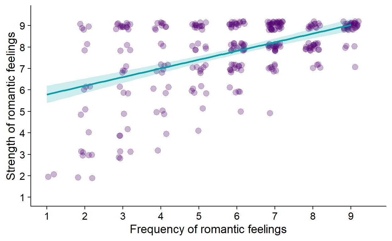
Figure 1: Linear relationship bwteen frequency and strength of romantic feelings.
Task 4.1
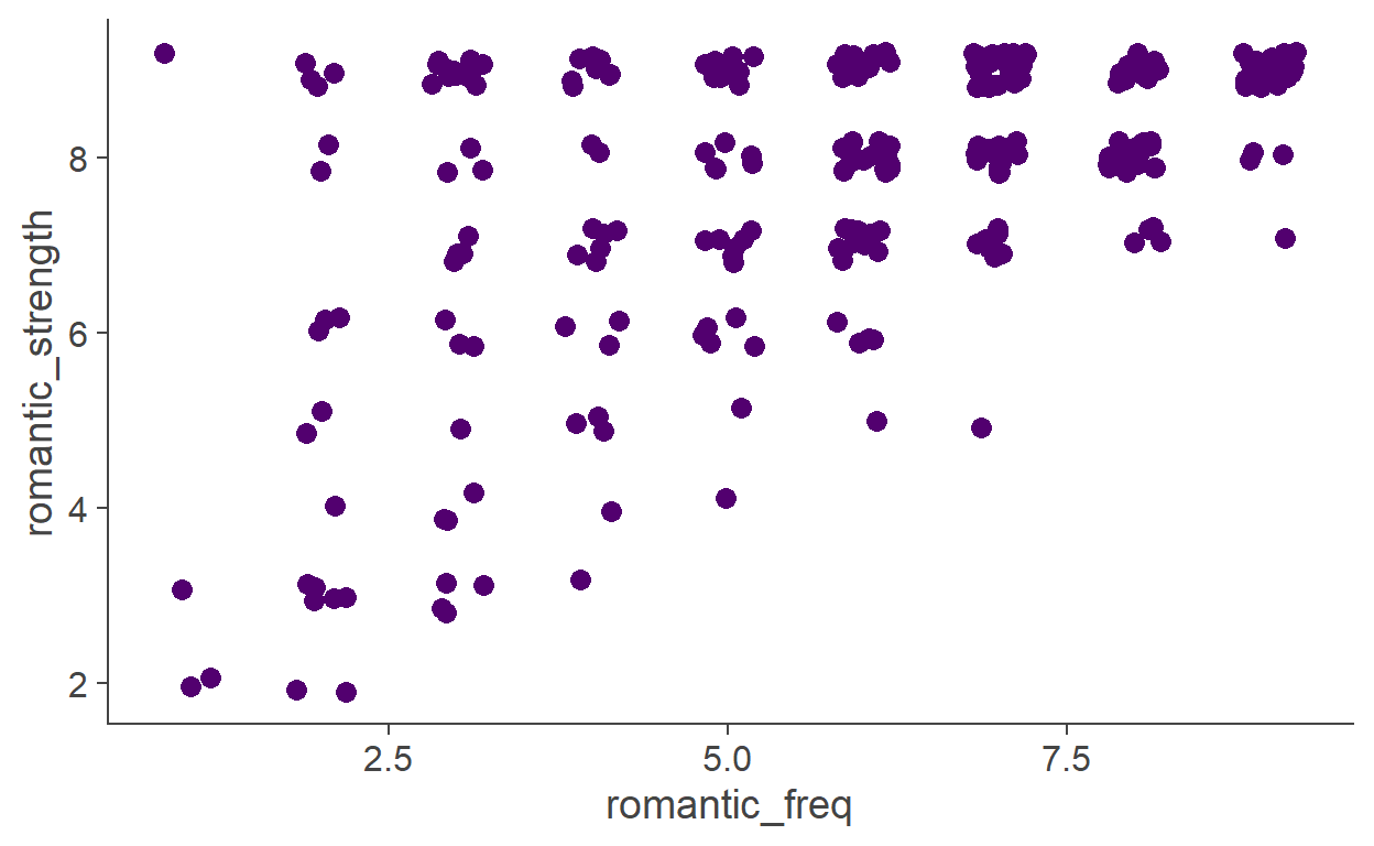
Make a basic scatterplot of the romantic_freq (x axis) and romantic_strength (y axis) variables. Set the colour and size of the points to something that looks nice to you
Scatterplots (or scattergrams) are composed of points.
The plot should look something like this:

gensex %>%
  ggplot(aes(romantic_freq, romantic_strength)) +
  geom_point(
    size = 3,
    colour = "#52006f"
  )
Let’s do something about the overplotting.
The term overplotting refers to the situation where there’s too many plotting elements on too little space. Because of the values our two variables take (1-9), there are only 81 (9 × 9) possible places for any given point. Given our sample size, this necessarily means that many of the points are just drawn on top of one another.
One way around this problem is randomly nudging each point horizontally and vertically by a small amount.
We can do that using the position = argument that can be given to geom_point(), passing the position_jitter() function to this argument.
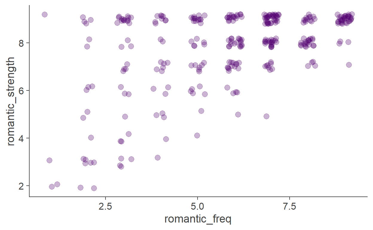
Task 4.2
Apply position_jitter() to the scatter.
The function works even if you don’t give it any argument. You can, however, control its behaviour - how much the points get nudged along the horizontal/vertical dimension.
gensex %>%
  ggplot(aes(romantic_freq, romantic_strength)) +
  geom_point(
    size = 3,
    colour = "#52006f",
    position = position_jitter(
      width = 0.2,
      height = 0.2,
      # setting a random seed to a number guarantees that
      # the points get jittered the same way every time
      seed = 1234))
Task 4.3
Another way of mitigating overplotting is using transparency. Make the points semi-transparent. If you don’t know how, look it up online.
You can look up something like “make points transparent in ggplot”.
# you can assign the plot a name...
my_scatterplot <- gensex %>%
  ggplot(aes(romantic_freq, romantic_strength)) +
  geom_point(
    size = 3,
    colour = "#52006f",
    position = position_jitter(
      width = 0.2,
      height = 0.2,
      # setting a random seed to a number guarantees that
      # the points get jittered the same way every time
      seed = 1234),
    alpha = .3) # 0 = fully transparent; 1 = fully opaque

# ...and call it to have it printed out
my_scatterplot
Task 4.4
Add the line of best fit with geom_smooth().
By default, the line drawn is not based on the linear model.
Check out the plots in Lecture 7 to see how you can change this.
geom_smooth() also takes cosmetic arguments, such as colour= (colour of the line), fill= (colour of the ribbon around the line), alpha=…
# You can add layers to a saved plot like this
my_scatterplot <- my_scatterplot +
  geom_smooth(
    method = "lm", # linear model
    fill = "#009fa7",
    colour = "#009fa7",
    alpha = .2) # 0 = fully transparent; 1 = fully opaque
Task 4.5
Set better axis labels, limits, and make both axes have ticks for every value (1-9).
There are multiple ways of doing each of these but you can set all of them with scale_x_continuous() and scale_y_continuous().
If you don’t know how to use these functions, look them up.
my_scatterplot <- my_scatterplot +
  scale_x_continuous(
    name = "Frequency of romantic feelings",
    limits = c(1, 9.5),
    # axis ticks
    breaks = 1:9) + # same as c(1, 2, 3, 4, 5, 6, 7, 8, 9)
  scale_y_continuous(
    name = "Strength of romantic feelings",
    limits = c(1, 9.5),
    breaks = 1:9)
Task 4.6
Pick a nice theme for your plot.
The one we used is theme_cowplot() from the cowplot package.
my_scatterplot <- my_scatterplot +
  cowplot::theme_cowplot()
Task 4.7
Finally, add a caption to your plot.
This is done using code chunk options.
```{r, fig.cap = "Linear relationship bwteen frequency and strength of romantic feelings."}
my_scatterplot
```
That’s one nice plot!
Linear model
Task 5
Write out the formula for a linear model m1, predicting the strength of a person’s romantic feelings by their frequency.
The following markdown…
$$\text{rom_strength}_i = b_0 + b_1 \times \text{rom_frequency}_i + e_i$$
… will get rendered as:
\[\text{rom\_strength}_i = b_0 + b_1 \times \text{rom\_frequency}_i + e_i\]
Task 6
Fit the linear model to your data and store it in the environment as m1.
Task 6.1
Write out the values of the intercept and the slope of romantic_freq as:
\(b_0 =\) [value]
\(b_1 =\) [value]
The safest way of doing this is to pull the numbers straight from the m1 object.
  (Intercept) romantic_freq
    5.3868621     0.4052915
(Intercept)
5.386862 romantic_freq
0.41 Now that we know how to get the values, we can use inline code chunk: `r [valid R code]`:
The following markdown…
$b_0 = `r coef(m1)[1] %>% round(2)`$
$b_1 = `r coef(m1)[2] %>% round(2)`$
… will get rendered as:
\(b_0 = 5.39\)
\(b_1 = 0.41\)
Task 7
Get R to calculate 95% confidence intervalse for the model parameters.
Looking up how to do things you don’t know how to do is a crucial skill you should hone. Try something like “get confidence intervals for lm in R”.
confint(m1)
                  2.5 %    97.5 %
(Intercept)   4.9135789 5.8601453
romantic_freq 0.3299713 0.4806118
Knit!
Task 8
Knit your worksheet once you’ve finished. You should see all of your code and output in the HTML document that it produces. This HTML will be saved in the same folder as the RMarkdown you knitted it from.
If you encounter a knitting error, bring it to the next practical!
Well done!
Make sure you have the RMarkdown or knitted HTML on hand when you take the worksheet quiz - you will need your answers to the above tasks.
Good luck!