Key Information
This week’s topic is comparing the means of two groups. We are building on the foundations of the t-distribution that we discussed in previous weeks to have a closer look at how to compare the means of two groups.
Comparing Means
In today’s example, we’re going to be investigating the differences between two groups of people. This tutorial will walk you through the process of posing a research question, defining your hypotheses, examining and visualising the data, and finally testing and reporting the results. To do this, we will be making use of a very common statistical procedure called the t-test.
Everything you need to know in order to perform a t-test successfully will be covered in this tutorial and in the Skills Lab this week. If you would like more information on both the theory and practice of t-tests, here are some resources to review:
- Recommended: Last year’s Analysing Data lecture on t-tests
- Danielle Navarro’s free Learning Statistics with R chapter on t-tests
- Focus on independent-samples t-tests
- Khan Academy lessons on t, confidence intervals, and comparing means
Background on the Data
Today’s data comes from Mealor et al.’s (2016) paper developing the Sussex Cognitive Styles Questionnaire (SCSQ), which is a six-factor questionnaire on different aspects of how people think about and experience the world (their “cognitive style”). The paper validates the new questionnaire by comparing responses from people with and without synæsthesia.
Synæsthesia
Synæsthesia is a neuropsychological condition that usually involves automatic and lifelong associations between stimuli that aren’t usually connected. In Mealor et al.’s study, there were two different types of synæsthetes (people with synæsthesia): grapheme-colour synæsthetes and sequence-space synæsthetes.
Grapheme-colour synæsthetes experience colour when they see or think about written language, such as letters or numbers.
Sequence-space synæsthetes experience sequences - such as days of the week, months of the year, or numbers - arranged in space around them.
If you’re interested, you can learn more about synæsthesia by watching this short video by synæsthesia researcher Richard Cytowic, or by Sussex’s own Prof Jamie Ward, but it’s not necessary in order to complete the tutorial.
The SCSQ Subscales
The Sussex Cognitive Styles Questionnaire (SCSQ) has six subscales that measure different dimensions of cognitive styles. Today’s practice will focuse on the Imagery Ability and Technical/Spatial subscales.
The six subscales are:
- Imagery Ability, measuring the use of visual imagery on a day to day basis
- Technical/Spatial, measuring spatial imagery, mathematical ability, and interest in technology
- Language and Word Forms, measuring interest in and attention to language
- Need for Organisation, measuring need for organisation
- Global Bias, measuring preference for holistic vs detail-oriented thinking
- Systemising Tendency, measuring interest in categorisation and systems
Scoring
On the SCSQ, all items are rated on a five-point Likert scale from 1 (strongly disagree) to 5 (strongly agree).
For each subscale, a person’s score is calculated as the mean rating on the items belonging to that scale. A higher score indicates a greater preference for the cognitive style that the subscale represents.
Right, enough background! Let’s dive in.
Setting Up
All you need is this tutorial and RStudio. Remember that you can easily switch between windows with the Alt + ↹ Tab (Windows) and ⌘ Command + ⇥ Tab (Mac OS) shortcuts.
Task 1
Create a new week_05 project and open it in RStudio. Then, create two new folders in the new week_05 folder: r_docs and data. Finally, open a new R Markdown file and save it in the r_docs folder. Since we will be practising reporting (writing up results), we will need R Markdown later on. For the tasks, get into the habit of creating new code chunks as you go.
Remember, you can add new code chunks by:
- Using the RStudio toolbar: Click Code > Insert Chunk
- Using a keyboard shortcut: the default is Ctrl + Alt + I (Windows) or ⌘ Command + Alt + I (MacOS), but you can change this under Tools > Modify Keyboard Shortcuts…
- Typing it out:
```{r}, press Enter, then```again. - Copy and pasting a code chunk you already have (but be careful of duplicated chunk names!)
Task 2
Add and run the command to load the packages you need in the setup code chunk.
Exploring the Data
Our experiment today will use real data from Mealor et al.’s (2016) study on synæsthesia.1 If you missed it, there’s a brief summary on what synæsthesia is in Key Background, above.
Task 3
Read in the data hosted at the link below and save it in a new object.
Link: https://and.netlify.app/datasets/syn_data.csv
syn_data <- readr::read_csv("https://and.netlify.app/datasets/syn_data.csv")
Task 4
To learn what these variables mean, have a look at the Codebook.
readr::read_csv("https://and.netlify.app/datasets/syn_codebook.csv")
Task 5
Have a poke around this dataset to get familiar with it.
Task 5.1
How many participants were there in this experiment? How many synæsthetes and non-synæsthetes?
Task 5.2
How many variables are there?
ncol(syn_data)
[1] 12Data Wrangling: Overall Imagery
For today’s analysis, we will investigate differences between synæsthetes and non-synæsthetes in overall imagery ability, across both visual and technical/spatial domains.2 Before we carry on with our analysis, let’s create a summary score that represents the mean of each participant’s score on the Imagery Ability and Technical/Spatial subscales of the SCSQ.
Task 6
Create a new variable, overall_img, that is the mean of the two imagery-related subscales mentioned above.
Think about what the mean/average is and how it’s calculated.
This one’s only a little bit tricky, but it’s nothing you couldn’t do.
Let’s first see what doesn’t work.
Perhaps it would seem intuitive to use the mean() function inside of mutate() but look at what happens when we try that:
As you can see (if you click through the table to see the last column in the data), all values of our new variable are the same. Every single value is just the mean of the two columns and not the mean of the two variables per each participant.
One way to resolve this is realise that we want to calculate the average of two things: someone’s score on the scsq_imagery variable and their score on the scsq_techspace variable.
How do we do that?
Well, we can simply create a new variable in which we add these two together and divide them by 2.
If you run this code, you should see a new variable in your dataset with a different number for each person.
We could also make use of the rowwise() function we’ve come across in previous skills labs:
Which will get us the same result in this case.
Study Design
Today we will be walking through the process of conducting an independent samples t-test. This test compares the means of two groups (“samples”) which each contain different entities/people (“independent”). We will test the null hypothesis that the sample means from our two independent groups are drawn from the same population.
To translate that into our current dataset, we will be comparing the means of imagery scores between groups of people with synæsthesia and people without. These groups are independent by definition: a person can either have synæsthesia or not, but they can’t be in both groups at once.
Task 7
Stop and think about this design before we go on. If you need a refresher, look back on Lecture 3 for a reminder of how to define the null and alternative hypotheses.
Task 7.1
What is the null hypothesis for this particular study? What pattern would we expect to see in the data if the null hypothesis were true? Write down your thoughts in your Markdown before you look at the solution.
Conceptually speaking, the null hypothesis in this case states that there is no relationship between the presence or absence of synæsthesia and a person’s overall imagery ability.
A statistical null hypothesis rephrases this in terms of equality of means of the imagery measure across the two groups of people: \[H_0: \mu_{I\_syn} = \mu_{I\_gen}\] (The \(I\_syn\) and \(I\_gen\) subscripts are just made up. There is no “official” notation.)
The important thing to understand is that the hypothesis is concerned with population parameters and that even if it’s true, we might still expect some differences in the sample.
If the null is true, however, we would expect the measured differences to be close to zero and equally likely positive and negative.
Task 7.2
What is the alternative hypothesis for this study? What pattern would we expect to see in the data if the alternative hypothesis were true? Write down your thoughts in your Markdown before you look at the solution.
The alternative hypothesis is simply a negation of the null hypothesis, and so if the null predicts no effect, the alternative hypothesis predicts some effect. In other words, the alternative hypothesis claims that there is indeed a relationship between the presence or absence of synæsthesia and one’s overall imagery ability.
A two-tailed statistical alternative hypothesis could be stated as: \[H_0: \mu_{I\_syn} \ne \mu_{I\_gen}\]
As you can see, this hypothesis makes no predictions about the direction of the relationship - only that the means are not equal.
If it is true, we would expect to observe more pronounced differences between the means of the two groups than if the null is true.
Task 7.3
Make a prediction: What do you think we will find? Do you think that there will be a difference in overall imagery ability? Write down your thoughts in your Markdown.
You can write whatever you like here, although do write something. It’s very important to think about - and document! - what you are expecting to find before you dive into your data.
Task 7.4
What alpha level would you choose for this test?
We should always decide significance level ahead of time, before we’ve seen the results of our tests.
Best practice is to be familiar with the research field and choose an appropriate alpha based on previous research. In this case, we’ll use a widely used alpha level of .05 for convenience, so that you don’t have to do any background reading!
The Plan
So, in order to find out whether people with and without synæsthesia differ in their imagery ability, the test follows this process:
First, we’ll need the mean overall imagery in each group. These two means represent our best guess about overall imagery ability for people who have have synæsthesia and who don’t.
Next, we’ll calculate the difference in the means between the two groups. This difference is a measure of the effect - the size of the impact on overall imagery associated with being a synæsthete or not.
Then, we (or rather, R!) will calculate an estimate of the standard error of the difference in the means. This is a measure of the error - how much variation there is among the differences in the means.
To calculate our test statistic, t, we then simply compare how big the effect is compared to the error. You can think of this as a signal-to-noise ratio - how big is the “signal” (the difference in imagery associated with synæsthesia) against the background of the “noise” (the variation in estimates of that difference in imagery)? In other words:
\[t = \frac{\text{difference in means}}{\text{estimated standard error of the difference}}\]
From here, we’re in familiar territory. We have a test statistic, t, that we calculated for our data. Since we’ve already practiced working with distributions, probabilities, and critical values, we know that all we need is the t-distribution with the right degrees of freedom. With that information, we can find the probability, p, of obtaining the t-value that we calculated or a more extreme one, assuming the null hypothesis is true.
The good news is, all of the calculations and values we need will be calculated by R for us, as we will see as we progress. Doing the calculation is R’s bit; interpreting the results and understanding what they mean for our understanding of the world is ours!
Descriptives and Visualisations
Now that we have our hypotheses and prediction nailed down, and we have a plan for our analysis, let’s have a look at the data!
Task 8
Create a summary tibble for the overall_img variable, split up by syn and containing:
- the number N in each group
- the mean and standard deviation of
overall_img - the standard error of
overall_img
Save the resulting tibble to a new object; I’m calling mine img_summary.
We made a table just like this in the Week 3 Practical!
If we have a look at the descriptives, we can immediately notice a few things: a big difference in N, similar (but not quite the same!) means, and a very similar SD but quite different SE.
Just looking at numbers isn’t always as helpful as we’d like. Before we test the differences in means statistically, let’s create a visualisation of our data to help us understand the means better.
Task 9
Using the tibble we’ve just created, let’s build a magnificent means plot to represent the means. We’ll start with a basic plot and build it up from there to create a publication-worthy, report-quality graph. In the end, it will look like this:

Task 9.1
Start by creating a basic means plot, and adding a theme to spruce it up.
We haven’t done means plots before, but we have made a plot in skills lab that had points in it. Do you have a summary tibble that contains the points you want to graph?
If you’re quite stuck, have a look at the skills lab recording and script.
For a theme, there are a lot pre-loaded in R. Check out theme_minimal() and theme_bw for clean, simple themes. Naturally, you can also install extra themes. I like theme_cowplot(), but you’ll have to install the cowplot package to use it. Any of these are fine - choose one you like!
For the simple means plot, we just need to tell R what data we want to use and then the kind of figure to draw. In this case, we’re using the data from our summary tibble, not from the whole dataset, because we want to plot the means and this tibble already contains them.
img_summary %>%
  # use variable names from the img_summary tibble
  ggplot(aes(x = syn, y = mean_img)) +
    geom_point() + # draw the points
  cowplot::theme_cowplot()

Hmm - those two dots floating in space aren’t very informative. It sure would be useful to have some error bars! That would help us understand something about how much scores vary around these means.
Task 9.2
Let’s now add error bars representing one SEM (standard error of the mean) to our points to make this an errorbar chart. To do this, we’ll need to add the following code to our ggplot() command:
geom_errorbar(aes(ymin = location_of_lower_bound,
                  ymax = location_of_upper_bound),
                  width = some_number)
To make this code work, we need to replace the three placeholder values, location_of_lower_bound, location_of_upper_bound, and some_number, with actual values
that R can understand. Let’s have a look again at what we’re trying to create:

In order to complete the function, we need to tell R where to draw the horizontal lines that cap off the error bars.
Remember that we want to create error bars that extend one SEM above the mean, and one SEM below the mean. Where in your summary tibble do you have this information?
Use the ymin = and ymax = arguments of geom_errorbar() to add one SEM errorbars.
img_summary %>%
  # use variable names from the img_summary tibble
  ggplot(aes(x = syn, y = mean_img)) +
    geom_point() + # draw the points
  geom_errorbar(aes(ymin = mean_img - se_img,
                    ymax = mean_img + se_img),
                width = .1) +
  cowplot::theme_cowplot()
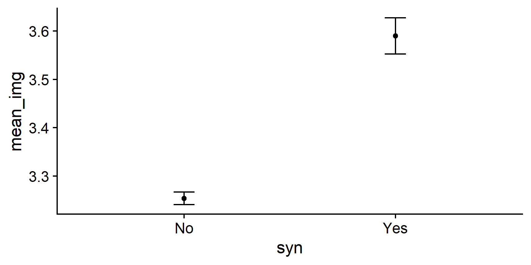
To define ymin and ymax, we simply tell R the location of the ends of the error bars by adding the length of the SEM to the mean, and subtracting it from the mean. R does the rest!
Adding 95% CIs
Errorbars in published plots often represent the 95% confidence interval around the point-estimate.
Naturally, you can to this relatively easily with ggplot2.
There are two main approaches to this task: either you prepare a summary tibble with a column representing the CIs to then feed to ggplot(), just like we just did with errorbars, or you use the stat_summary() function instead of our two geom_ functions.
stat_summary allow you to tell ggplot() how to summarise the raw data before plotting and so, instead of a summary table, we will be using the raw dataset:
syn_data %>%
  ggplot(aes(x = syn, y = overall_img)) + # raw data
  # use summary with the mean function to add points
  stat_summary(geom = "point", fun = mean) +
  cowplot::theme_cowplot()

Now that we have our points, we can add another layer of stat_summary(), this time with the "errorbar" geom and a different summary function, mean_cl_boot(), to give us the 95% CIs:
syn_data %>%
  ggplot(aes(x = syn, y = overall_img)) +
  stat_summary(geom = "point", fun = mean) +
  # add 95% CI errorbars
  stat_summary(geom = "errorbar", fun.data = mean_cl_boot,
               width = .1) +
  cowplot::theme_cowplot()

You can style this plot further in exactly the same way as you would any other.
Task 9.3
Style the axes of this plot to make them clear and easy to read.
scale_x_discrete()to change the name and labels on the x-axisscale_y_continuous()to change the name on the y-axis
There are lots of ways to change the names of scales, including labs(). I like doing them separately with these scale_ functions because you can also use them to change other things, like what numbers appear on the y-axis, and what the labels are for categories. Ultimately you should build your plots in a way that makes sense to you, and that ends up looking the way you want it.
For example, in the solution I’ve also added another argument to scale_y_continuous, namely limits. This changes the minimum and maximum values on the y axis. This is optional, but you can try messing about with these two arguments to see what happens if you want to get a feel for how it works.
Use the help documentation if you’re not sure how to use these functions!
img_summary %>%
  # use variable names from the img_summary tibble
  ggplot(aes(x = syn, y = mean_img)) +
  geom_point() + # draw the points
  geom_errorbar(aes(ymin = mean_img - se_img,
                    ymax = mean_img + se_img),
                width = .1) +
  scale_x_discrete(name = "Presence of synaesthesia") +
  scale_y_continuous(name = "Mean Overall Imagery Score",
                     limits = c(3,4)) +
  cowplot::theme_cowplot()

Task 9.4
Optionally, you can style the points as well. Let’s make them larger, turn them into diamond shapes, and give them a more interesting fill colour.
Because we want to change the points that represent the means, we add some arguments to geom_point(). Among others, you can specify arguments called size, shape, fill, and colour to change the appearance of the points. Give it a go and see what happens!
The shape argument takes a number corresponding to a shape. Try Googling “graph shapes in R” for some options.
To add colours, you can use either named colours that R knows, or hexidecimal colour codes.
R recognises a lot of colour names. Just put the name you want in “quotes” to use it.
If you want a very precise shade that isn’t on the list of coloured names, you can also use any colour that your heart desires using the colour’s hexidecimal code. The hex code is a series of 6 letters and numbers that uniquely specify any colour in the RGB colour gamut. You can try typing random ones, or use this handy colour selector to get the exact shade you want.
If you wanted the Analysing Data theme colours, you could use darkcyan or #009Fa7 for teal, and #52006F or purple4 for the purple.
img_summary %>%
  # use variable names from the img_summary tibble
  ggplot(aes(x = syn, y = mean_img)) +
  geom_errorbar(aes(ymin = mean_img - se_img,
                    ymax = mean_img + se_img),
                width = .1, colour = "#52006F") +
  geom_point(size = 3, shape = 23, fill = "#009Fa7", colour = "#52006F") +
  scale_x_discrete(name = "Presence of synaesthesia") +
  scale_y_continuous(name = "Mean Overall Imagery Score",
                     limits = c(3,4)) +
  cowplot::theme_cowplot()
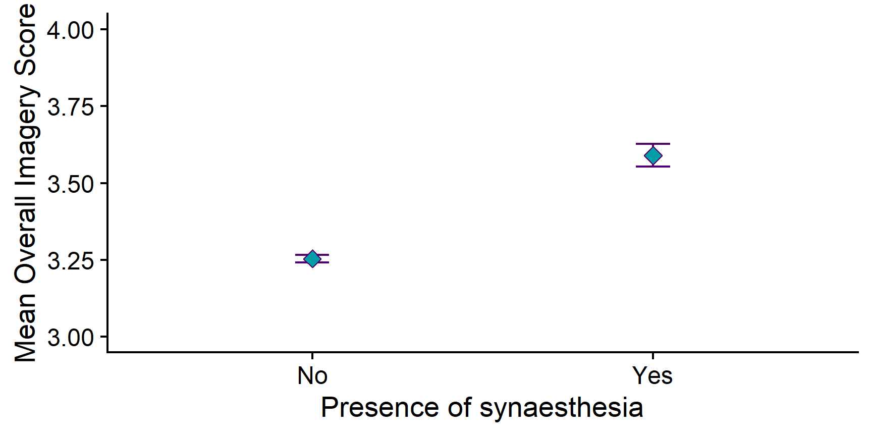
Now, as stylish and attractive as that Analysing Data colour palette is, it isn’t really suitable for formal reporting. Let’s tone it down a bit.
Task 9.5
Choose a more formal colour for the points if you didn’t already.
img_summary %>%
  ggplot(aes(x = syn, y = mean_img)) +
  geom_errorbar(aes(ymin = mean_img - se_img,
                    ymax = mean_img + se_img),
                width = .1) +
  geom_point(size= 3, pch = 23, fill = "grey") +
  scale_x_discrete(name = "Presence of synaesthesia") +
  scale_y_continuous(name = "Mean Overall Imagery Score",
                     limits = c(3,4)) +
  cowplot::theme_cowplot()

Now that’s looking good!
Choosing Axis Limits
Deciding how to present your data is always a compromise. In the plot above, the y-axis only covers the space between ratings 3 and 4 on the Likert scale. This allows us to clearly see the error bars, especially relative to the difference between the means, but it can also be somewhat misleading about how big the differences in the means actually are.
Expanding the y-axis limits to the entire length of the original scale removes this ambiguity and puts the difference in context, but it squishes down the error bars and makes the overall difference between the means less clear.
img_summary %>%
  ggplot(aes(x = syn, y = mean_img)) +
  geom_errorbar(aes(ymin = mean_img - se_img,
                    ymax = mean_img + se_img),
                width = .1) +
  geom_point(size= 3, pch = 23, fill = "grey") +
  scale_x_discrete(name = "Presence of synaesthesia") +
  scale_y_continuous(name = "Mean Overall Imagery Score",
                     limits = c(1,5)) +
  cowplot::theme_cowplot()

Ultimately, it’s up to you which one you pick and both choices are justifiable. In fact, Jennifer prefers the full range axis, while Milan would go for the highlighted differences…
The important thing to understand is that you are the one making a decision and you should have the tools to implement it.
Now that we have a clear, nicely formatted visualisation of the means, let’s take a moment to think about what we can learn from this.
Task 10
How can you interpret the means in this plot? Write down your thoughts in your Markdown.
In our sample, synæstheses have a higher mean imagery score than non-synæstheses. However, it is not possible to tell just by looking at the points whether or not this difference is statistically significant!
Now that we’ve had a look at our data, we can move on to actual statistical testing!
The t-test
Running the Analysis
So, we’ve made our predictions, and we’ve had a look at the data. Now we’re ready to conduct our t-test.
Task 11
Conduct the independent samples t-test.
Task 11.1
Look up the help documentation for t.test(). How will you write the formula to specify your analysis?
?t.test()
Under “Arguments”, the entry for formula tells us that this should be “a formula of the form lhs ~ rhs where lhs is a numeric variable giving the data values and rhs either 1 for a one-sample or paired test or a factor with two levels giving the corresponding groups.”
So, the first element of the formula should be a numeric variable with the data values. In our case, this will be our overall_img variable, which contains the numeric imagery scores. Notice that we are using the whole dataset, rather than the img_summary tibble we created for plotting.
The second element should be our grouping variable. Here, this is the variable that contains a code for whether someone is a synæsthete or not: in our dataset, syn.
Putting it all together, we can write the formula as: overall_img ~ syn.
Task 11.2
Use the t.test() function to perform an independent samples t-test on the syn_data data to find out whether there is a difference in overall_img between syn groups.
Use the outcome ~ predictor formula, with the alternative = "two.sided" option.
We can either do this in a single command or in a pipe. Either one will produce the same result.
## Single command
t.test(overall_img ~ syn,
         data = syn_data,
         alternative = "two.sided")
    Welch Two Sample t-test

data:  overall_img by syn
t = -8.5053, df = 150.58, p-value = 1.67e-14
alternative hypothesis: true difference in means between group No and group Yes is not equal to 0
95 percent confidence interval:
 -0.4141795 -0.2580225
sample estimates:
 mean in group No mean in group Yes
         3.253940          3.590041
If you use the pipe version, you must put in the data = . argument, otherwise you’ll get an error!
Pretty painless, eh?
Now let’s interpret the results, now that we finally have them.
Interpreting the Results
Task 12
Look over the output. Let’s interpret it together.
Task 12.1
How big is the difference between the means? Write down what you understand from the results in your Markdown.
There’s a couple ways to interpret this question.
We can first look at the raw difference in the means - which just means, subtracting one mean from the other. If we do this, we can see that the difference is −0.34. That doesn’t seem like much - but that isn’t the whole story.
The output also tells us the value of the t-statistic. This represents the difference between the means we just calculated, divided by the standard error of the difference between the means. You can think of it as the “standardised” difference, which takes into account how much variance there is in the estimates of this difference. We can see from the output that this number is −8.51.
Task 12.2
Is a t of −8.51 a big difference? How do you know?
Think about what the distribution of t. What values of t are common? Which are unusual?
If you’re really stuck, have a look at what you already know about the t-distribution.
Have a look at the t-distribution on the linked slide in the hint, and dial the degrees of freedom all the way up to 100. The degrees of freedom in our test was 150.58, but you can see as you move the slider that the distribution doesn’t change much as you get up to 100 df, so we can use this visualisation to approximate.
We can see in the visualisation that values of t of ±1, near the centre of the distribution, are very common; values of ±3, in the tails of the distribution, are really unusual; and values like −8.51 are literally off the charts! This value of t is so extreme that it’s not even on this scale (which only goes up to ±5).
So, given the distribution of t under the null hypothesis, it’s clear that a value of −8.51 is extremely unusual.
Task 12.3
What is the probability of obtaining this value of t under the null hypothesis?
The output tells us this directly: the p-value is 1.670429e-14. This is quite a weird number, but notice the “e-14” bit at the end. This is scientific notation, telling us that the decimal point is actually 14 places to the left! Turning off the scientific notation, this number is 0.00000000000001670429 - which is very, very small.
Task 12.4
Putting everything together, what can we learn from this result? Write down your thoughts in your RMarkdown.
Remember to review lecture 3 on null hypothesis significance testing if you’re not sure how to interpret this result.
We’ve asked R to tell us about the difference between two sample means. To quantify this, we’ve calculated a test statistic, t, of −8.51. R then compares this value for t to the distribution of t under the null hypothesis with 150.58 degrees of freedom, to tell us the probability of obtaining this value, or one more extreme, if the null hypothesis is true. Remember that our null hypothesis, in this case, is that there is no true difference between the means - in other words, that the two samples come from the same underlying distribution. In our study, that would mean that being a synæsthete or not makes no systematic difference to overall imagery score, and any differences we do observe are not systematically attributable to synæsthesia.
However, our results indicate that if the null hypothesis is true - if there really is no relationship between imagery score and synæsthesia - then our results are extremely unlikely. Remember that at the beginning, we chose an alpha level of .05. We can now compare our calculated p-value from our test to our alpha level. If our p-value is smaller than .05, we have evidence that the null hypothesis may not be true, because the result that we have is so unlikely. We could then conclude that our results are statistically significant.
Assuming we’ve set up our study carefully3, we can reject the null and accept the alternative: that being a synæsthete is associated with a difference in overall imagery ability.
Reporting the Results
Now that we’ve got our test result, let’s finish up by reporting it in APA style. This takes the general form:
estimate_name(degrees_of_freedom) = estimate_value, p = exact_p, Mdiff = difference_in_means, 95% CI = [CI_lower, CI_upper]
In APA style, we’ll round all numbers to two decimal places where appropriate, except for p. We round p to three decimal places, unless it’s smaller than .001, in which case we simply report “p < .001”.
Task 13
Use the general format above and the values to type out the result of the t-test.
We start with the general form:
estimate_name(degrees_of_freedom) = estimate_value, p =_p, Mdiff = difference_in_means, 95% CI [CI_lower, CI_upper]
Now we need each of these values from the output:
- estimate_name: t
- degrees_of_freedom: 150.58
- estimate_value: −8.51
- p: < .001
- difference_in_means: −0.34
- CI_lower: −0.41
- CI_upper: −0.26
So, our reporting should look like: t(150.58 = −8.51, p < .001, Mdiff = −0.34, 95% CI [−0.41, −0.26]
What is Mdiff?
Everything we’ve reported above we’ve seen before, except for Mdiff. This represents the differences in the means of the two groups. This is a key element of the t-test, but it’s also important because the 95% CIs are an interval estimate around that mean difference. Without reporting Mdiff, the CIs are quite hard to interpret!
Task 14
Put all of this together into one report of your findings. Include both descriptives (M and SD in both groups) as well as the results of your statistical test.
You should write this in your own words, but here’s an example:
“Synæsthetes had a higher mean imagery scores (M = 3.59, SD = 0.41) than non-synæsthetes (M = 3.25, SD = 0.43). This difference was statistically significant according to the independent samples t-test, t(150.58) = −8.51, p < .001, Mdiff = −0.34, 95% CI [−0.41, −0.26]. We thus found support for the alternative hypothesis and reject the null hypothesis of no differences.”
Together with the graph we already made, this would make a great report!
Recap
Well done conducting your t-test.
In sum, we’ve covered:
- How to create professional means plots
- How to run the independent samples t-test and read the output
- How to report and interpret the statistical results of these tests in real-world terms
Remember, if you get stuck or you have questions, post them on Piazza, or bring them to practicals or to drop-ins.
Good job!
That’s all for today. See you soon!
Jennifer hates spelling the word with the æ ligature but hey, I have the keys to the website ~Milan
That’s true, but I’m not typing that every time, so edit it yourself if you like! ~Jennifer
You betcha I will! ~Milan↩︎The difference in imagery between synæsthetes and non-synæsthetes is well-documented; see e.g., O’Dowd et al. (2019)↩︎
This is a massive assumption that we’re brushing by very casually here! Reasons this might not be true is if there is some other systematic difference between our two groups that we haven’t accounted for. For example, imagine we had recruited our non-synæsthetes from the general population, but our synæsthetes from a fine arts academy. In that case the difference in imagery ability we observed might not be due to synæsthesia at all.↩︎