In this tutorial, you’ll get started working with the linear model. The goal of this tutorial is to get a feel for the equation of a line and the basic structure of the lm() function. We’ll be spending a lot of time on linear models, so just focus on getting the basics down for now.
Setting Up
All you need is this tutorial and RStudio. Remember that you can easily switch between windows with the Alt + ↹ Tab (Windows) and ⌘ Command + ⇥ Tab (Mac OS) shortcuts.
Task 1
Create a new week_08 project and open it in RStudio. Then, create two new folders in the new week_08 folder: r_docs and data. Finally, open a new R Markdown file and save it in the r_docs folder. Since we will be practising reporting (writing up results), we will need R Markdown later on. For the tasks, get into the habit of creating new code chunks as you go.
Remember, you can add new code chunks by:
- Using the RStudio toolbar: Click Code > Insert Chunk
- Using a keyboard shortcut: the default is Ctrl + Alt + I (Windows) or ⌘ Command + Alt + I (MacOS), but you can change this under Tools > Modify Keyboard Shortcuts…
- Typing it out:
```{r}, press Enter, then```again. - Copy and pasting a code chunk you already have (but be careful of duplicated chunk names!)
Task 2
Add and run the command to load the tidyverse package in the setup code chunk.
The Linear Model
Let’s start with a refresher to get warmed up. In the lecture we learned about the equation of a line, a very important equation that we will be using again and again.
This equation has the following elements:
- \(y\): The value of the outcome
- b0: the intercept, or value of the outcome when the predictor is 0
- b1: the slope, or change in the outcome for each unit change in the predictor
- x1: the predictor
These definitions are important for you to know, but if they don’t make a lot of sense at the moment, don’t worry - that’s what this tutorial is for. We’ll start by getting a handle on what the b-values do first, and then we’ll move on to creating a linear model with the familiar gensex dataset to get some practice using these values.
Using the Equation
Before we jump into the data, let’s have a go practicing with the model itself and getting the hang of how it works. To do this, we’ll use the beautiful interactive visualisation below, courtesy of Milan.
Using the Visualisation
The yellow line, our linear model, is determined by two values:
- b0, the intercept, in purple
- b1, the slope, in teal
You can change the values of each by moving the sliders. The numbers in the coloured circles correspond to the line above. You can reset the sliders to 0 by double clicking on them.
As you move the teal b1 slider, notice the solid horizontal black line that moves up and down. Where this line connects with the y axis is the predicted value of y when x = 1.
Task 3
Spend a minute playing with the visualisation and moving both sliders to get the hang of how it works. Then try out the quiz questions below.
What happens to the line as you change the value of b0 (purple slider)?
The location of the line changes (up and down)
Well done!Give the sliders another go and try again :)
What happens to the line as you change the value of b1 (teal slider)?
The slope of the line changes
Well done!Give the sliders another go and try again :)
Set the sliders so that the line slopes down from left to right. What is the direction of the relationship quantified by b1?
Negative
Well done!Look at whether the sign is + or - in the teal circle!
Set b0 to -.66 and b1 to 4.65. What’s the predicted value of y to the nearest whole number?
4
Correct!That’s not right…
Well done so far. You can keep playing with the visualisation as much as you like - it will help a lot if you can understand how these values work in the linear model equation.
Flatlining
Before we move on, let’s take a look at a special scenario. Move or reset the sliders so that the line is perfectly horizontal, then answer the following questions.
When the linear model is perfectly horizontal, what is the value of b1?
0
Correct!That’s not right…
The larger the value of b1, the steeper the line. If you move the sliders to their extremes in either direction, you can see that that’s true for both positive and negative values of b1. When the line is flat, b1 is 0.
When b1 is 0, what is the relationship between x and y?
No relationship
Well done!Not quite…
This is an important point, so make sure you think it through. Remember that the slope of the line captures the change in y for each unit change in x. If the slope is 0, that means that no matter how much x changes, y doesn’t change at all. So, in other words, there is no relationship between x and y.
Why is this so important? You might recognise “no relationship between x and y” as a way we often state the null hypothesis. We’ll talk more next week about hypothesis testing for linear models, but right now, the key is to realise that a b1 of 0 means no relationship.
Now that we have a sense of how the b-values in the linear model work, let’s move on to looking at some data. Remember that you can always come back to the visualisation if you’d like to practice with the equation more.
lm() in R
Let’s have another look at the gensex data we’ve been working with all term. We’ve only had a look at a few variables thus far, but there’s lots more interesting info here!
Creating the Model
Task 4
Read in the gensex data, using the link below.
Link: https://and.netlify.app/datasets/gensex_2022.csv
gensex <- readr::read_csv("https://and.netlify.app/datasets/gensex_2022.csv")
This time we’ll use some different variables. I’ll be using romantic_freq`` andsexual_freq`, which are ratings of how frequently the participants experience romantic and sexual attraction respectively. A higher score indicates higher frequency.
Task 5
What do you think the relationship between your two variables will be? Take some notes in your RMarkdown document. Consider:
- What direction will the relationship be in?
- Will it be a positive or negative relationship?
- What would this look like in the linear model?
- How strong will the relationship be?
- What will it look like for the relationship to be stronger or weaker?
Task 6
Run the linear model with the following steps.
Task 6.1
Write the formula for lm(), using frequency of romantic attraction as the predictor and frequency of sexual attraction as the outcome.
Just like we saw previously with t.test(), the formula should take the form outcome ~ predictor. In this case, the outcome is sexual_freq and the predictor is romantic_freq, so the formula is: sexual_freq ~ romantic_freq
Task 6.2
Use the lm() function to create a linear model with these variables and save it as freq_lm.
Interpreting the Model
Call the freq_lm object and use the output to answer the following questions. Round all your answers to 2 decimal places.
If you get stuck on any of these questions, see the solution to the task after the quiz.
What is the value of b0 in this analysis?
3.38
Correct!That’s not right…
What is the value of b1 in this analysis?
0.47
Correct!That’s not right…
What is the direction of the relationship between these variables?
Positive
Well done!What is the sign (+ or -) of b1?
Task 7
In your RMarkdown document, write the equation of the linear model for this analysis.
To do this, start with the equation of the line: \(y_{i} = b_{0} + b_{1}x_{1i}\)
Then, let’s see what the freq_lm results are:
freq_lm
Call:
lm(formula = sexual_freq ~ romantic_freq, data = gensex)

Coefficients:
  (Intercept)  romantic_freq
       3.3814         0.4682
In the output we have two labeled numbers: (Intercept) and romantic_freq. The first, labeled (Intercept), is the value we’ve been calling b0. The second is labeled with the name of the predictor, and is the b1 value quantifying the relationship between that predictor and the outcome.
With both of those numbers, we can create an equation for the linear model by replacing the values of b0 and b1 with the numbers in the output, and replacing the placeholders \(y\) and \(x\) with the names of the predictors.
Putting everything together, we can update our equation: \(SexualFreq_{i} = 3.38 + 0.47\times{RomanticFreq_{i}}\)
Task 8
In your RMarkdown document, write down your interpretation of the b1 value you obtained. What does it tell you?
The b1 value quantifies the relationship between the frequency of romantic and sexual attraction. What does this mean?
The b1 value, 0.47, tells you how much the frequency of sexual attraction changes, for each unit increase in the frequency of romantic attraction. In this case, the units of the romantic attraction variables are points on the rating scale, from 1 to 9. So, for every one-point increase in romantic attraction frequency, we would predict that sexual attraction frequency goes up by 0.47 rating points.
Task 9
Move the sliders in the interactive visualisation above to set the visualisation to the same values from your model. Is this the strength and direction of the relationship you predicted? Write down your thoughts in your RMarkdown.
Task 10
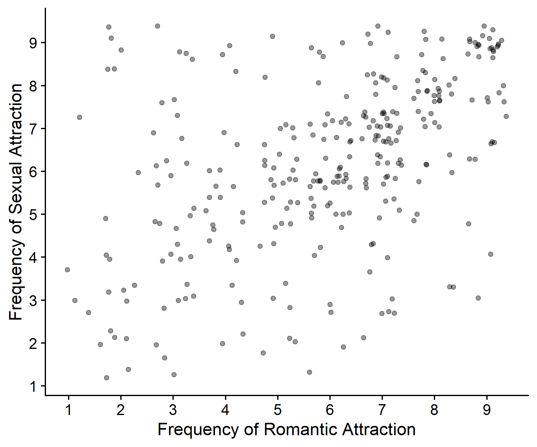
Create a scatterplot of the same variables, with romantic_freq on the x axis and sexual_freq on the y axis, and tweak the formatting to make it look professional.
If you don’t remember how to create a scatterplot, have a look back at Skills Lab 2.
gensex %>%
  ggplot(aes(x = romantic_freq, y = sexual_freq)) +
  geom_point(position = "jitter", alpha = .4) +
  scale_x_continuous(name = "Frequency of Romantic Attraction",
                     breaks = c(0:9)) +
  scale_y_continuous(name = "Frequency of Sexual Attraction",
                     breaks = c(0:9)) +
  cowplot::theme_cowplot()
Task 10.1
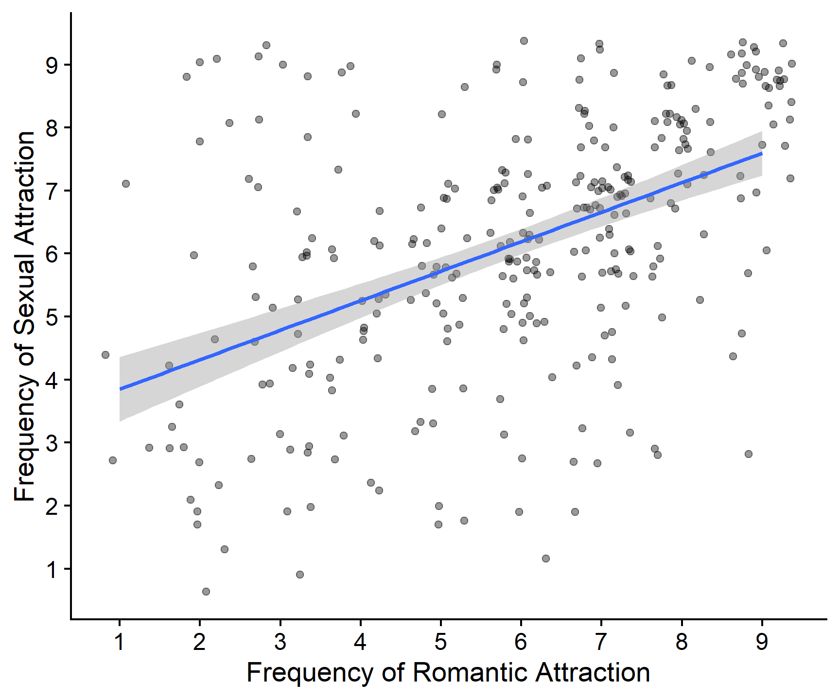
Optionally, figure out how to add a line of best fit to this plot. Does it look like you expected based on the visualisation?
Do some Googling and figure out how to add a line of best fit to your plot. There are tons of resources on the Internet, and lots of ways you can accomplish this task.
Alternatively, check out the R Code panels for the plots in the lecture.
For the line of best fit, anything that looks similar to the below and makes sense to you is great! Here’s one option using geom_smooth().
gensex %>%
  ggplot(aes(x = romantic_freq, y = sexual_freq)) +
  geom_point(position = "jitter", alpha = .4) +
  scale_x_continuous(name = "Frequency of Romantic Attraction",
                     breaks = c(0:9)) +
  scale_y_continuous(name = "Frequency of Sexual Attraction",
                     breaks = c(0:9)) +
  geom_smooth(method = "lm", formula = y~x) +
  cowplot::theme_cowplot()
Task 11
Imagine you have a friend who would rate their frequency of romantic attraction as a 2. What does your model predict their frequency of sexual attraction would be?
4.32
Correct!That’s not right…
Start with the equation for this model: \(SexualFreq_{i} = 3.38 + 0.47\times{RomanticFreq_{i}}\)
To solve the equation, replace the name of the variable, \(RomanticFreq_{i}\), with the value for this particular case - here, 2. Then, solve the equation for the predicted value of \(SexualFreq_{i}\).
\(SexualFreq_{i} = 3.38 + 0.47\times{2}\)
\(SexualFreq_{i} = 3.38 + 0.94\)
\(SexualFreq_{i} = 4.32\)
Task 12
Overall, what have we discovered about the relationship between the frequency of sexual and romantic attraction? What don’t we know yet? Write down your thoughts in your Markdown.
Really take the time to think about this! What does the positive value of b1 tell you? How can you interpret the plot? What does this tell you about attraction?
Our linear model quantifies the relationship between the frequency of sexual and romantic attraction. It’s positive, so that tells us that people who experience romantic attraction more frequently also tend to experience sexual attraction more frequently - which is what we might expect. The b1 value tells us that for each point increase on the romantic attraction frequency scale, sexual attraction increases by about half a point.
There are still a good few things we don’t know yet:
We might like to know whether this half-point increase in the outcome for every point increase in the predictor is a big increase in the grand scheme of things. Is this something we should believe is real, or important?
Is this relationship between romantic and sexual attraction frequency big enough to believe that it’s unlikely to occur if in fact the true relationship between these variables is 0 - that is, is it significant?
These are questions we’ll come back to next week, so stay tuned!
Recap
Well done on all of your hard work! Make sure you work on these ideas and get them down clearly; they will be very important for the rest of the module. You should now be able to do the following:
- Understand how the b0 (intercept) and b1 (slope) values specify the line
- Explain why a b1 value of 0 represents no relationship between the predictor and the outcome
- Create a linear model using
lm() - Write an equation for the linear model using
lm()output - Use the equation to calculate a predicted value for the outcome, given a value of the predictor.
Good job!
That’s all for today. See you soon!